R Graphics for Exploring Data
The graphics device prints the graphics to screen or into a file type read by other apps. The screen device is on our computers. For windows its windows(), mac its quartz() and Linux its x11(). I am assuming this is built into the R functions plot(), xyplot(), and qplot() when we use them to plot. The other “devices” are the file types that are created by the device. PDF, PNG, JPEG, SVG file types are ways to plot graphics and view and share the plot. It depends where the plot is sent. Searching in RStudio I type: ?Devices, and get a List of Graphical Devices found in the {grDevices} package that came loaded with RStudio. The available devices are windows, pdf, postscript, xfig, bitmap, and pictex. The other devices that may produce a warning message are: cairo.pdf, svg, png, jpeg, bmp, tiff. Some of these I recognize when I export a graph and save as image. If you are on Mac I would guess the first one would be the quartz() and you wouldn’t see “windows” nor “x11” I would also presumption that with the 10,000+ packages for R there are more graphic devices available. There are two formats for the file devices which are vector and bitmap graphics. Vectors are more for line type graphics with simple color palettes, while bit maps are more like a very dense scatter plots or pictures that can handle color gradients and mixed colors. The par() function sets the graphics device parameter in R and allowed plots to show up side by side and one on top of the other. par() format stays on and will continuously show successive plots together side by side. The dev.off() function is key here to reset the screen device parameters.
The R package used is the “datasets” package that contains all of the data sets used for these examples. The analysis demonstrate the base plotting abilities of RStudio.
This section uses the iris data set. The first plot is a summary of the base plotting capabilities.
library(datasets)
str(iris)
## 'data.frame': 150 obs. of 5 variables:
## $ Sepal.Length: num 5.1 4.9 4.7 4.6 5 5.4 4.6 5 4.4 4.9 ...
## $ Sepal.Width : num 3.5 3 3.2 3.1 3.6 3.9 3.4 3.4 2.9 3.1 ...
## $ Petal.Length: num 1.4 1.4 1.3 1.5 1.4 1.7 1.4 1.5 1.4 1.5 ...
## $ Petal.Width : num 0.2 0.2 0.2 0.2 0.2 0.4 0.3 0.2 0.2 0.1 ...
## $ Species : Factor w/ 3 levels "setosa","versicolor",..: 1 1 1 1 1 1 1 1 1 1 ...attach(iris)The plot() function has several parameters. pch= is the symbol used in the graph (20,16,19 are filled circles), cex= is the the symbol size (1) is default, lty= is line type shown in later plots, and lwd= is the line width also shown in other plots. The col= is the plotted color, here it defaults to the first three colors in the color palette. The main= is the title of the plot, the xlab/ylab are the labels for the xy axis. The legend() function creates the legend for the graph and the placement is the xy coordinates of the top left corner of the box. The name of the points are entered and the colors are assigned. Again this is incorrect to show magenta, cyan, yellow. The next plot will correct those.
plot(Sepal.Length, Petal.Length, type="p", pch=19, col=Species, cex=1, main="Petal Length vs Sepal Length", xlab="Sepal Length in mm", ylab="Petal Length in mm")
legend(x=4.5, y=7, legend=c("Setosa","Versicolor","Virginica"), col=c("black", "red","green"), pch=16)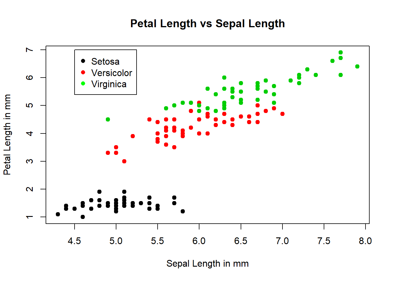
Fixed the legend color to match the scatter points and moved to lower right corner.
plot(Sepal.Length, Petal.Length, type="p", pch=19, col=Species, cex=1, main="Petal Length vs Sepal Length", xlab="Sepal Length (in mm)", ylab="Petal Length (in mm)")
legend(x=6.75, y=3.25, legend=c("Setosa","Versicolor","Virginica"), col=c(1:3), pch=19, cex=1.5)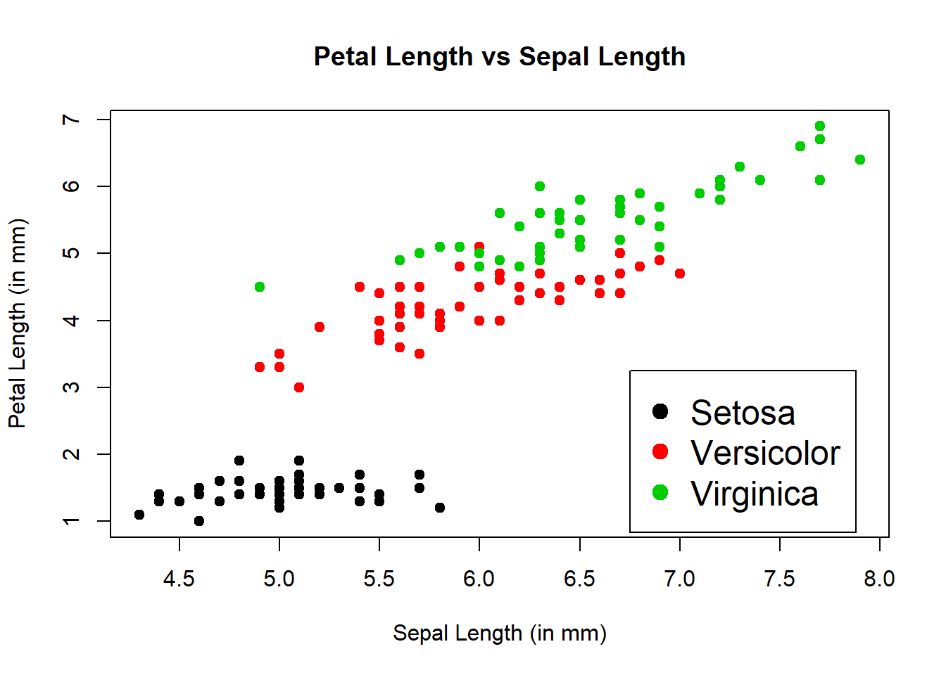
The box plot functions shown below are a nice way to also look at variables side by side. Same labeling scheme as the plot() function. New is cex.lab= makes the axis labels larger by 1.5 times, cex.axis= enlarged the xy increment text by 1.5 times, and the cex.main= enlarges the main title by 2 times. The last box plots has the title shifted over to the y-axis and removes the x-axis label.
boxplot(Sepal.Length~Species)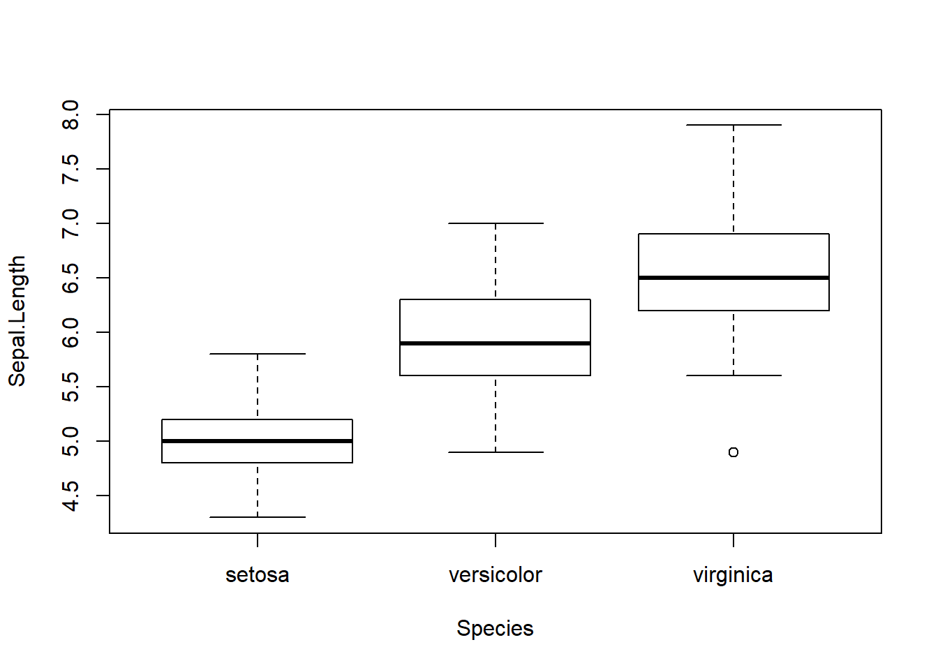
boxplot(Sepal.Length~Species, ylab="Sepal Length", xlab="Species", main="Sepal Length vs Species", cex.lab=1.5)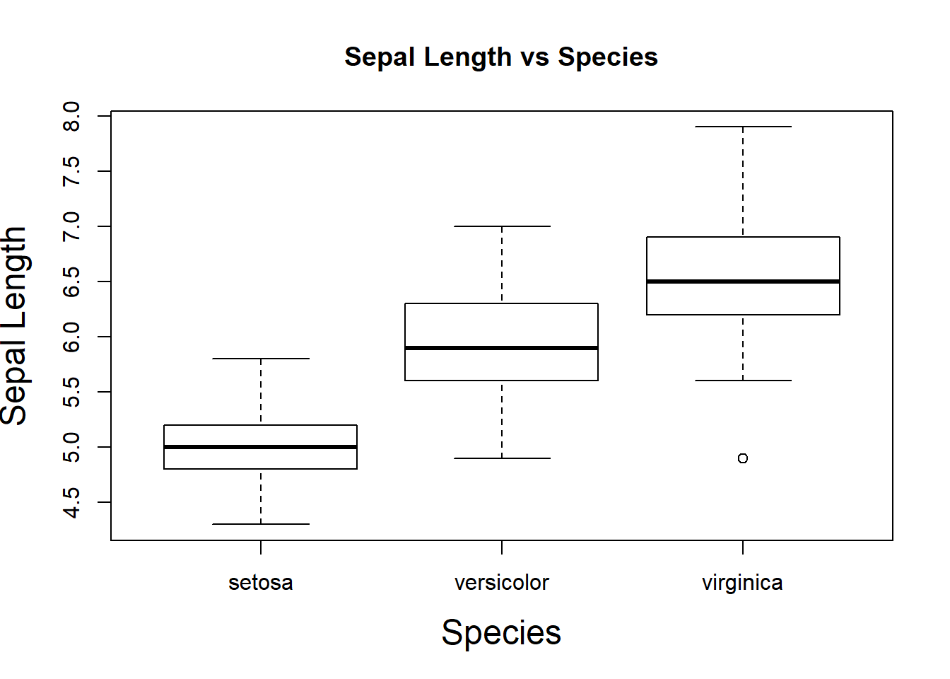
boxplot(Sepal.Length~Species, ylab="Sepal Length", xlab="Species", main="Sepal Length vs Species", cex.lab=1.5, cex.axis=1.5, cex.main=2)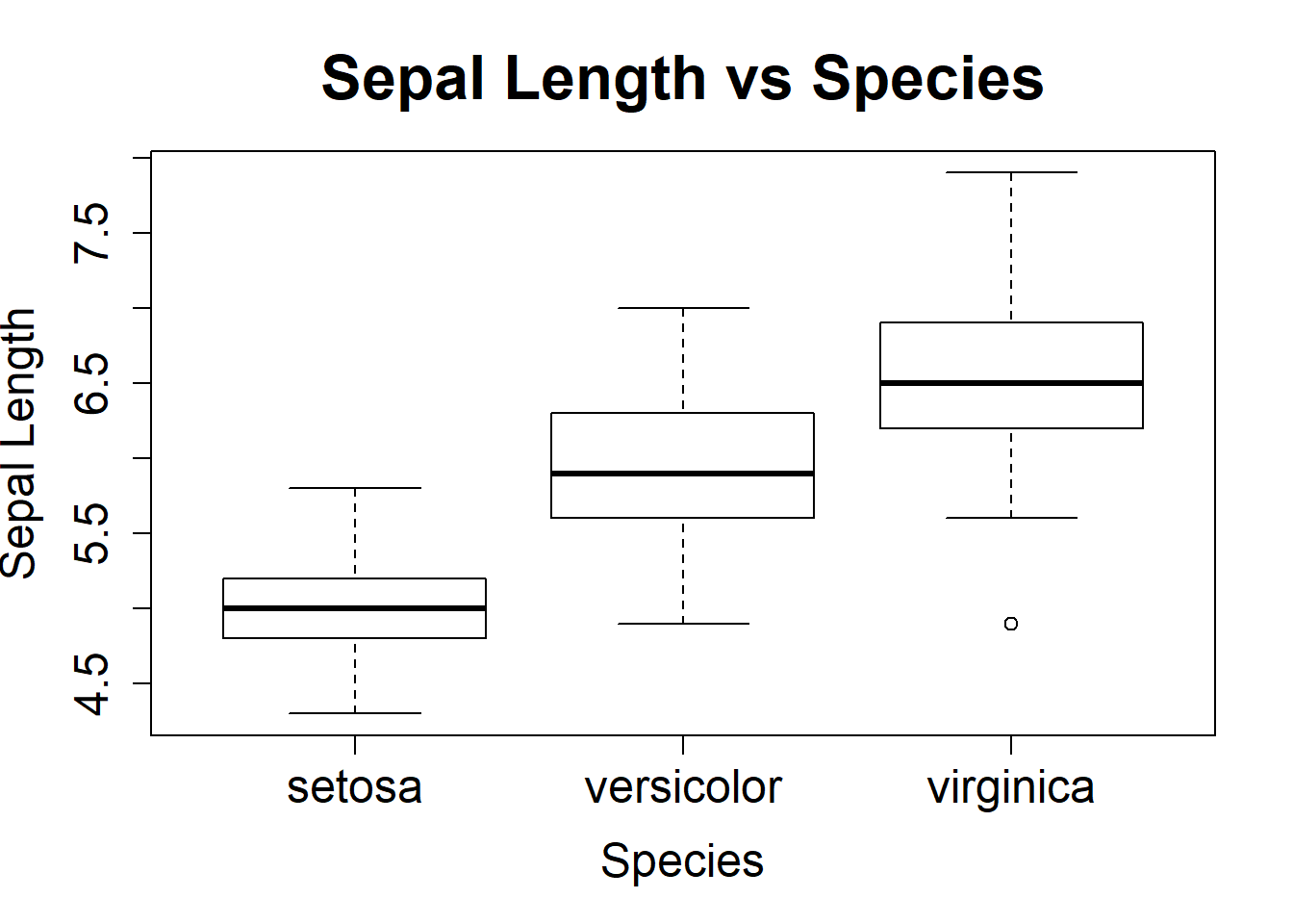
boxplot(Sepal.Length~Species, ylab="Sepal Length vz Species", cex.lab=1.5, cex.axis=1.5, cex.main=2)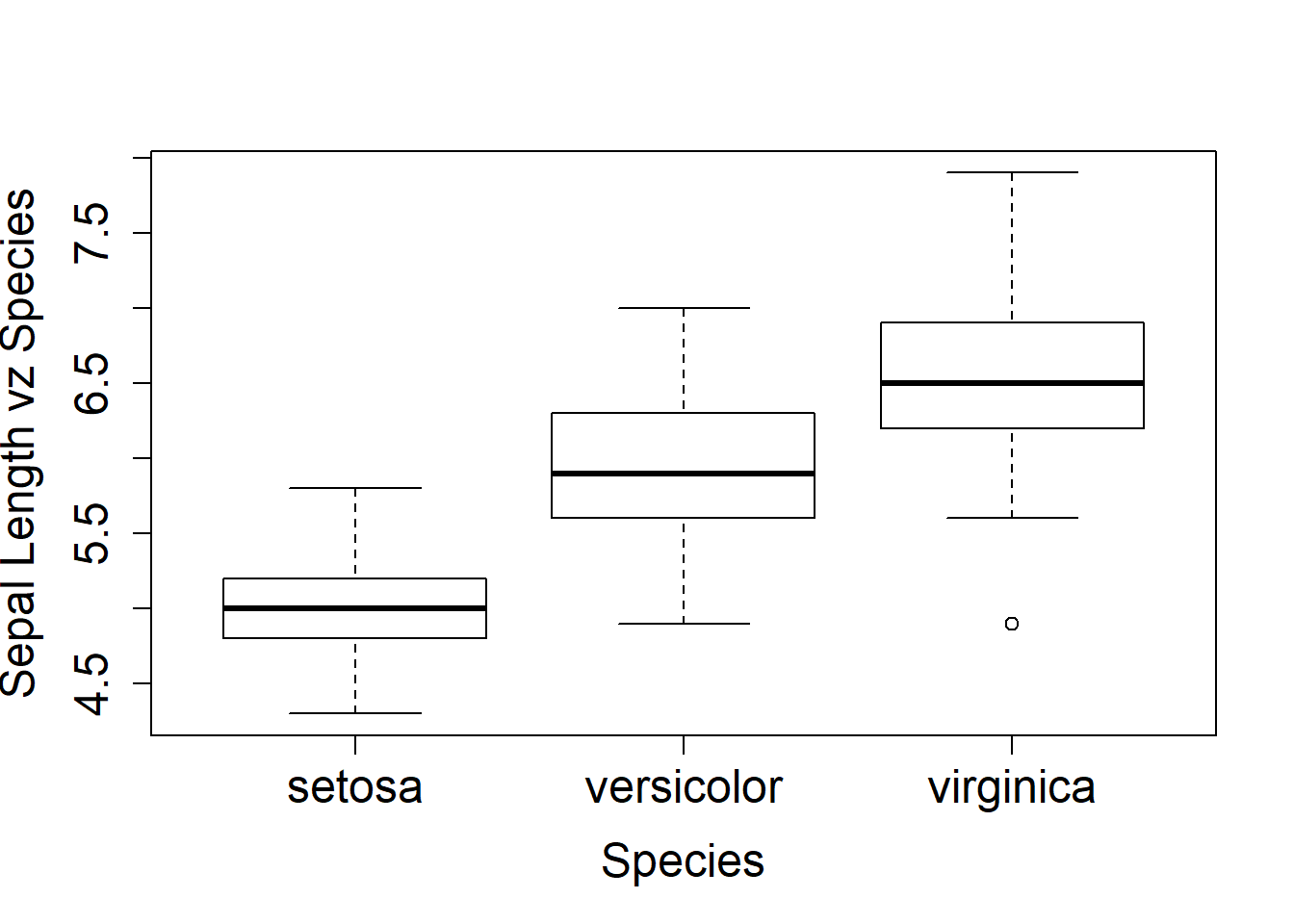
The faithful data set briefly shown in a scatter plot. The with() function is to evaluate an expression in an environment constructed from the data. plot(faithful) would do the graph in this case, however when there are more elements there could be naming conflicts. We use the with() function later in the Base Plotting.
data(faithful)
head(faithful)
## eruptions waiting
## 1 3.600 79
## 2 1.800 54
## 3 3.333 74
## 4 2.283 62
## 5 4.533 85
## 6 2.883 55with(faithful, plot(eruptions, waiting))
title(main="Old Faithful Geyser Data")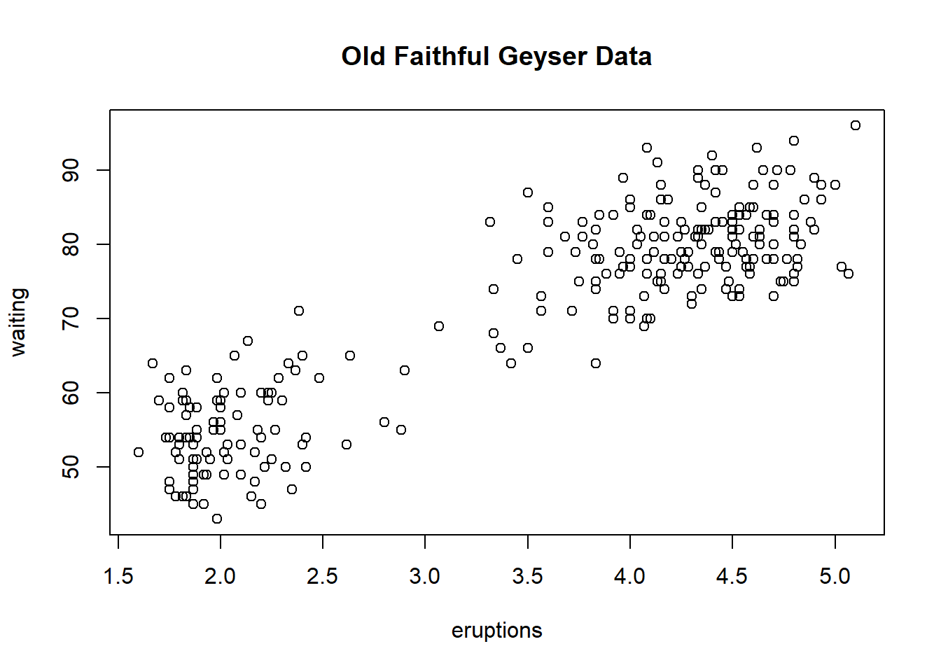
data("cars")
dim(cars)
## [1] 50 2cars$speed## [1] 4 4 7 7 8 9 10 10 10 11 11 12 12 12 12 13 13 13 13 14 14 14 14 15 15
## [26] 15 16 16 17 17 17 18 18 18 18 19 19 19 20 20 20 20 20 22 23 24 24 24 24 25plot(cars$speed, cars$dist)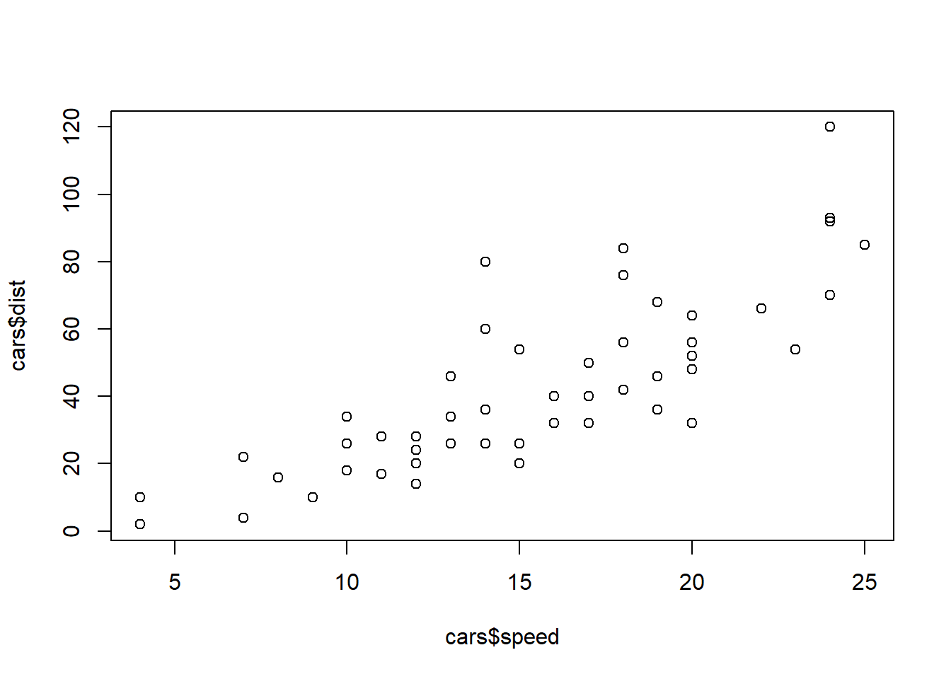
plot(cars$speed, cars$dist, pch=19, col=4, main="Stopping Distance verses Speed", xlab="Speed", ylab="Stopping Distance")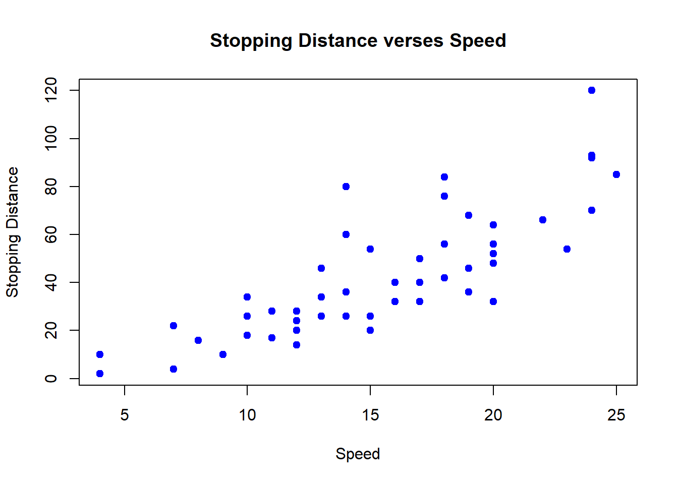
The color scheme here adds color to incrementally every 10 units to distinguish into groups by different colors. It uses the default color palette to assign the color to each group starting at 1=black to 5=cyan.
plot(cars$speed, cars$dist, pch=19, col=rep(1:5,each=10), main="Stopping Distance verses Speed", xlab="Speed", ylab="Stopping Distance")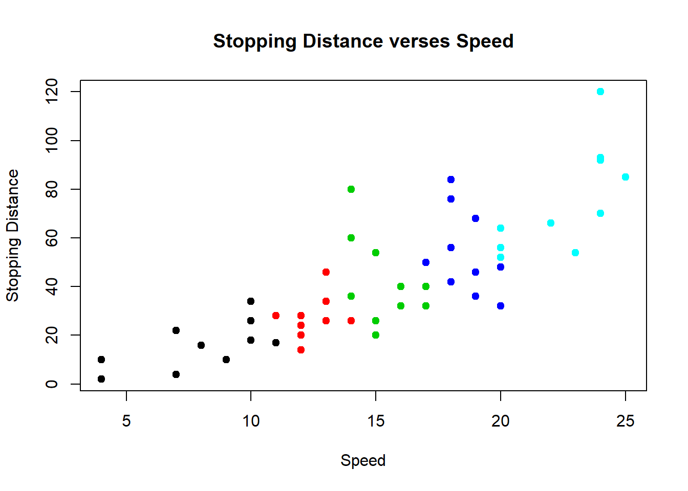
Table the data and then plot. Gives another way to look at the speeds represented in the cars data set.
speed.tab <- table(cars$speed)
plot(speed.tab)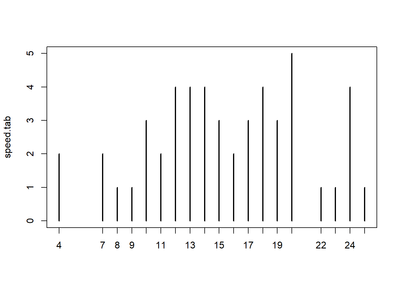
barplot(speed.tab)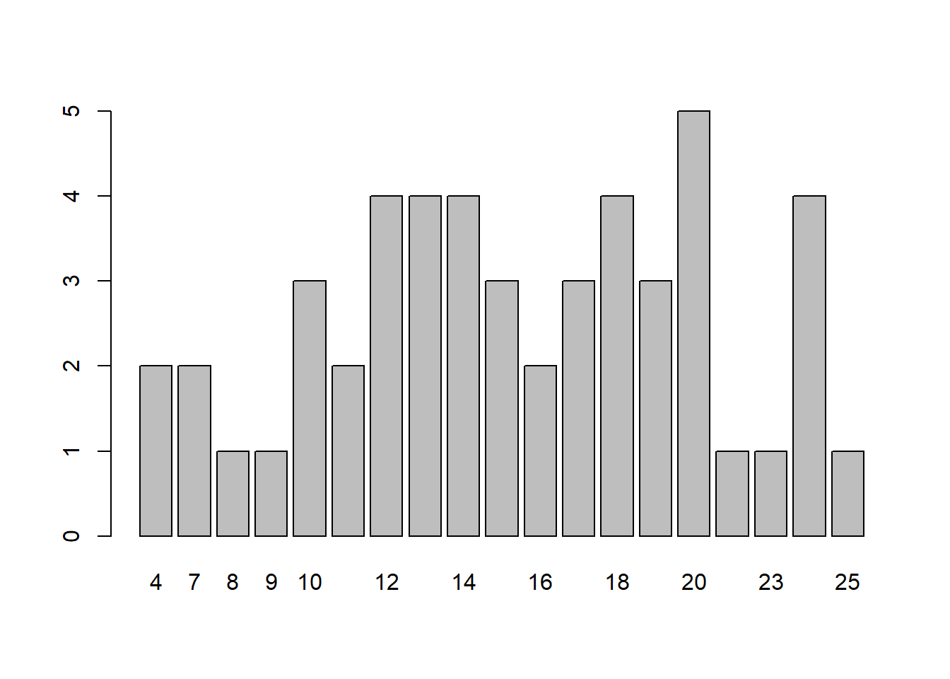
hist(cars$speed)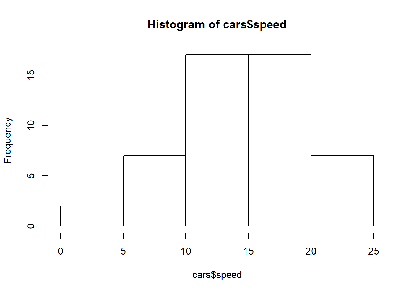
hist(cars$speed, main="Histogram of Car Speeds", xlab="Speed", ylab="Frequency", breaks=10)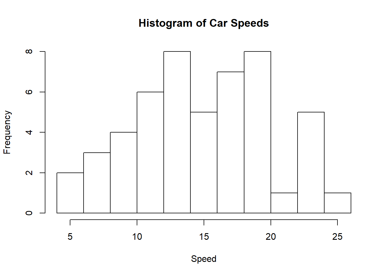
hist(cars$speed, main="Histogram of Car Speeds", xlab="Speed", ylab="Frequency", breaks=10, col="wheat")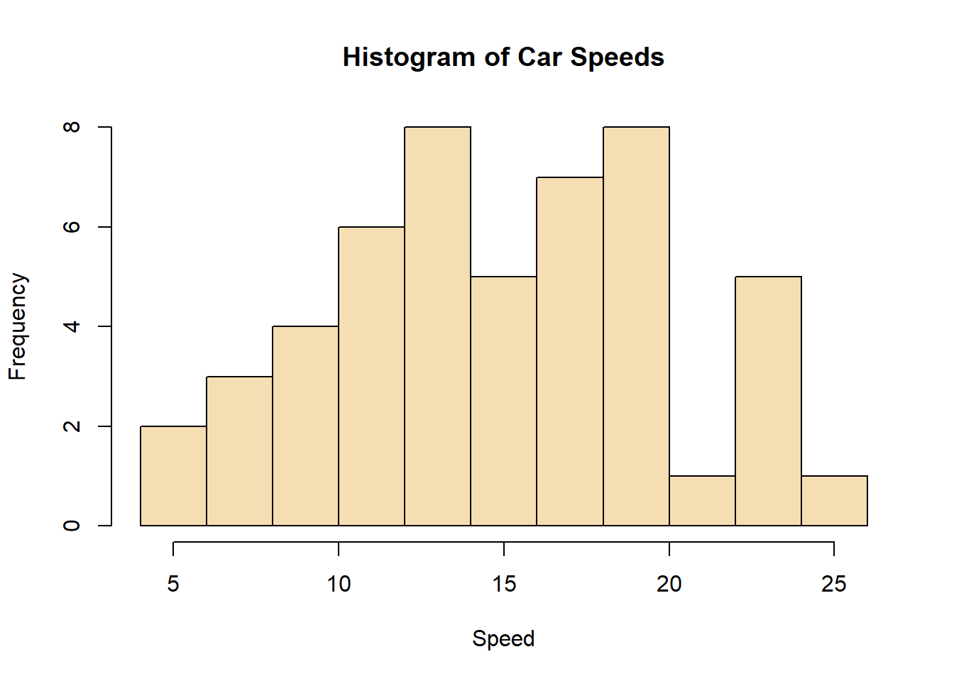
hist(cars$speed, main="Histogram of Car Speeds", xlab="Speed", ylab="Frequency", breaks=10, col="wheat", ylim=c(0,12))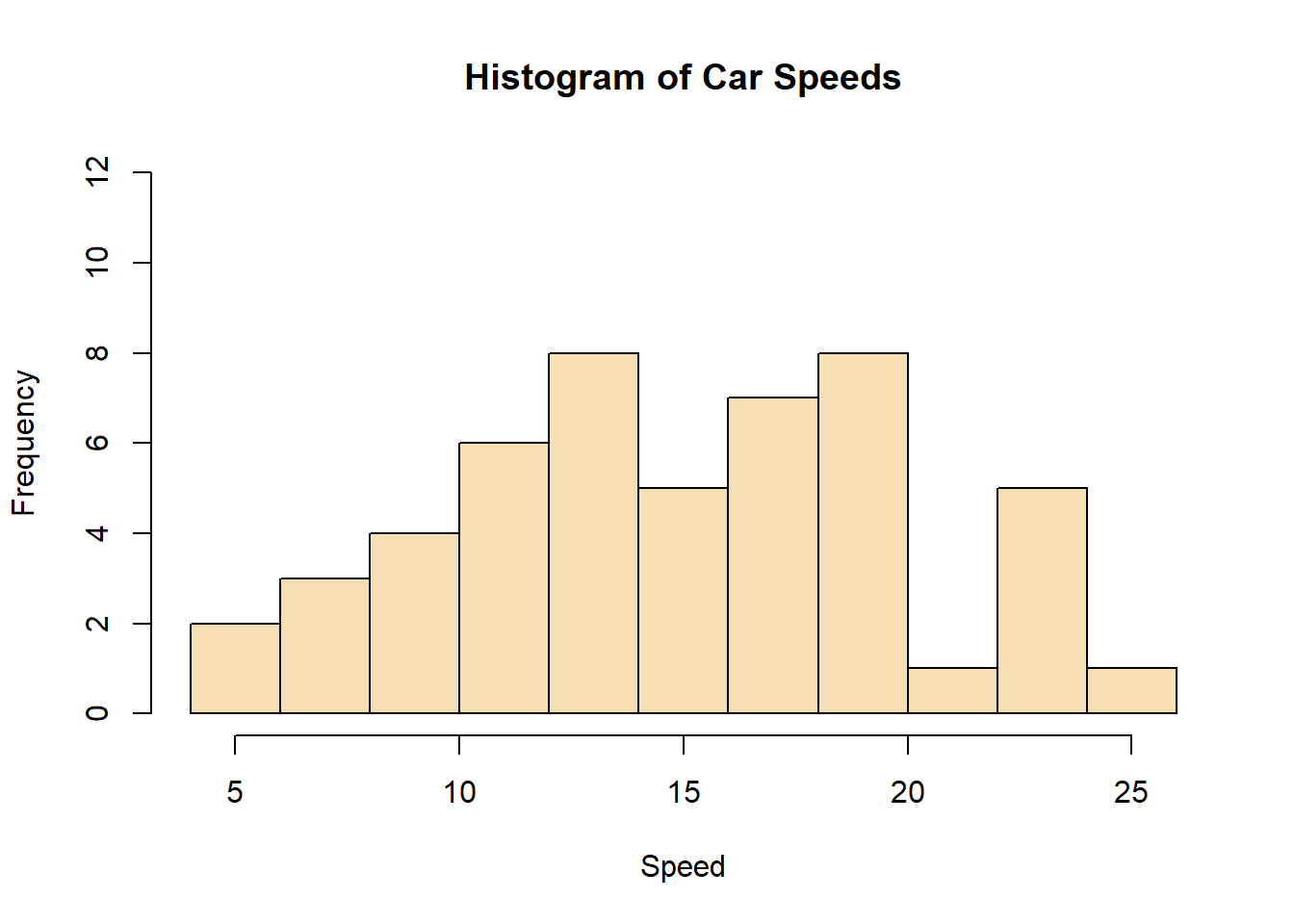
This shows the line graphing mentioned at the beginning. type=“l” sets the plot as a line graph. type=“o” is over plotted among others available to customize. The lty= can be set to a dashed line. The col= adds color to the line, red in this case and thickening of the line with lwd=3.
plot(cars$speed, cars$dist, type="l")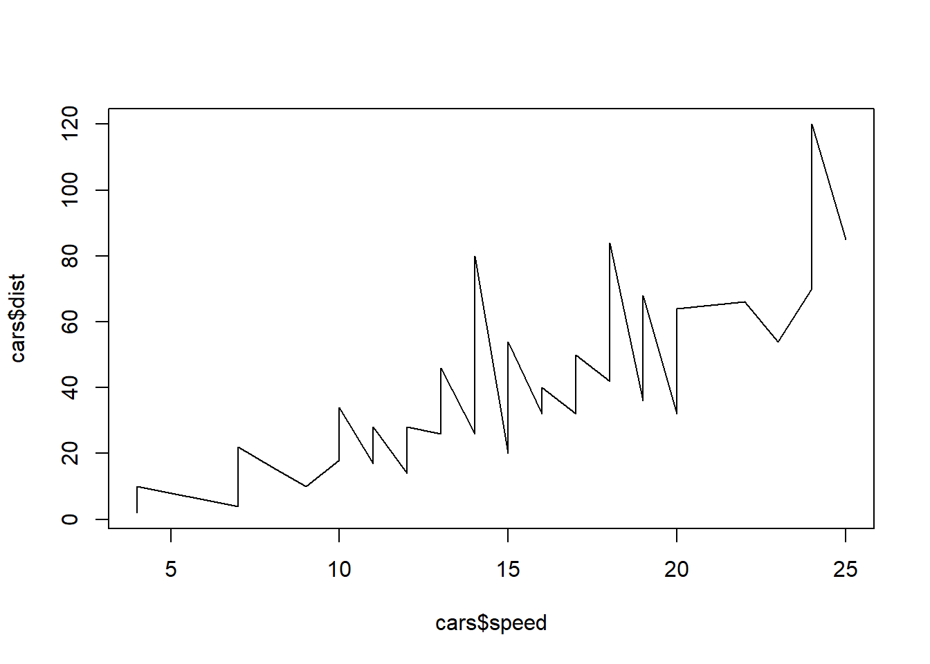
plot(cars$speed, cars$dist, type="o")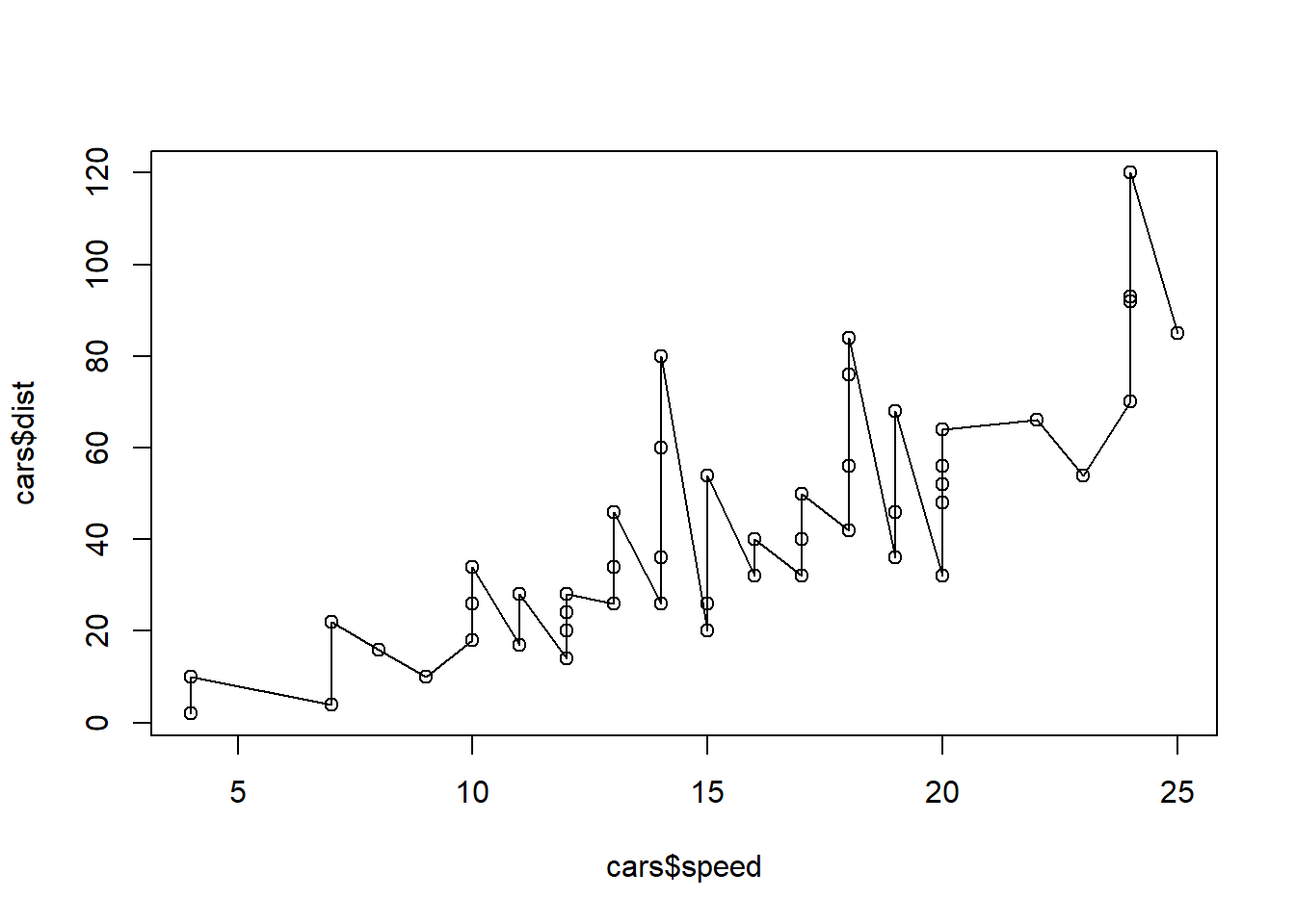
plot(cars$speed, cars$dist, type="l", lty="dashed")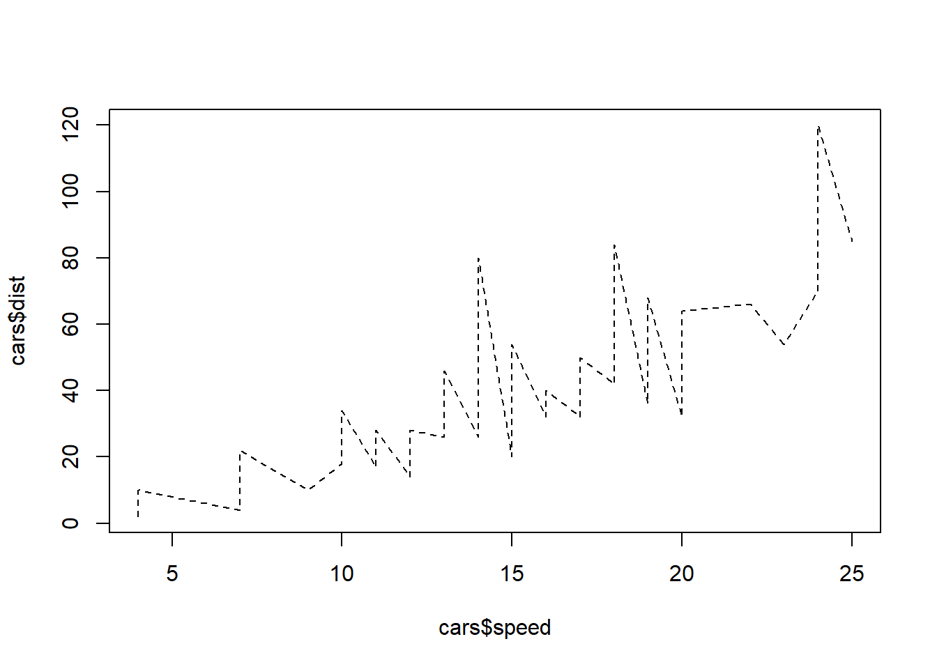
plot(cars$speed, cars$dist, type="l", col=2)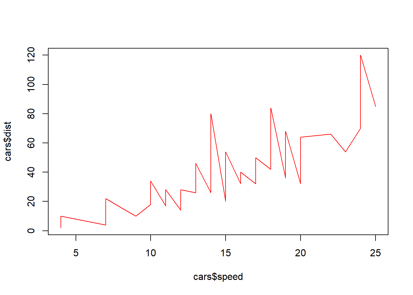
plot(cars$speed, cars$dist, type="l", col=2, lwd=3)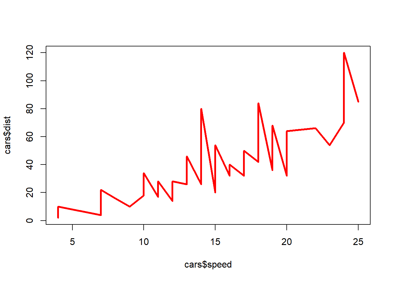
plot(cars$speed, cars$dist, type="l", col=2, lwd=3, xlab="Car Speed", ylab= "Stopping Distance", main="Data on Stopping Distance of Cars")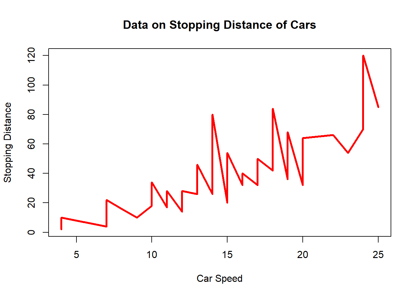
plot.new() #reset to new plot frame
plot(cars$speed, cars$dist, type="l", col=2, lwd=3, xlab="Car Speed", ylab= "Stopping Distance", main="Data on Stopping Distance of Cars")
fit1 <- lm(dist~speed, data = cars) #linear regression model
summary(fit1)
##
## Call:
## lm(formula = dist ~ speed, data = cars)
##
## Residuals:
## Min 1Q Median 3Q Max
## -29.069 -9.525 -2.272 9.215 43.201
##
## Coefficients:
## Estimate Std. Error t value Pr(>|t|)
## (Intercept) -17.5791 6.7584 -2.601 0.0123 *
## speed 3.9324 0.4155 9.464 1.49e-12 ***
## ---
## Signif. codes: 0 '***' 0.001 '**' 0.01 '*' 0.05 '.' 0.1 ' ' 1
##
## Residual standard error: 15.38 on 48 degrees of freedom
## Multiple R-squared: 0.6511, Adjusted R-squared: 0.6438
## F-statistic: 89.57 on 1 and 48 DF, p-value: 1.49e-12abline(fit1, lty="dashed") #plotting the linear regression line
text(x=10, y=100, labels="Average Distance = \n3.9324 Meters per Mile of Speed") #\n (new line, and label the graph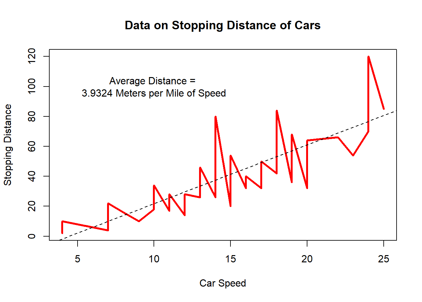
data(iris)
head(iris)
## Sepal.Length Sepal.Width Petal.Length Petal.Width Species
## 1 5.1 3.5 1.4 0.2 setosa
## 2 4.9 3.0 1.4 0.2 setosa
## 3 4.7 3.2 1.3 0.2 setosa
## 4 4.6 3.1 1.5 0.2 setosa
## 5 5.0 3.6 1.4 0.2 setosa
## 6 5.4 3.9 1.7 0.4 setosapairs(iris) #scatterplot matrices to compare variables to each other.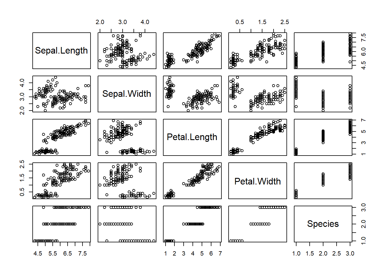
pairs(iris, col=iris$Species) #adds the default color scheme to each Species like before.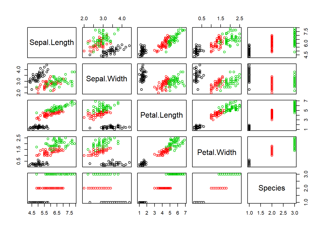
plot(iris$Sepal.Length, iris$Petal.Length, col=iris$Species) #same plot as the beginning but with different pch=
plot(iris$Sepal.Length, iris$Petal.Length, col=iris$Species, pch=15) #different pch=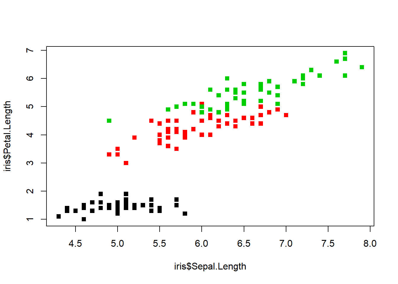
plot(iris$Sepal.Length, iris$Petal.Length, col=iris$Species, pch=16)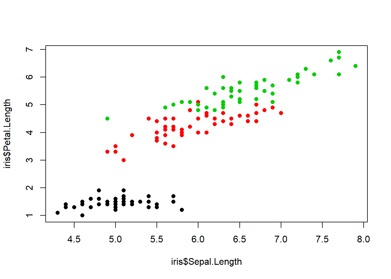
Example graphic that was refined and cleaned up at the beginning of this exercise above.
plot(iris$Sepal.Length, iris$Petal.Length, col=iris$Species, pch=16,cex=1)
levels(iris$Species)
## [1] "setosa" "versicolor" "virginica"legend(x=4.5, y=7, legend=levels(iris$Species), col=c(1:3), pch=16)
legend(x=4.5, y=7, legend=c("Setosa","Versicolor","Virginica"), col = (1:3), pch=16)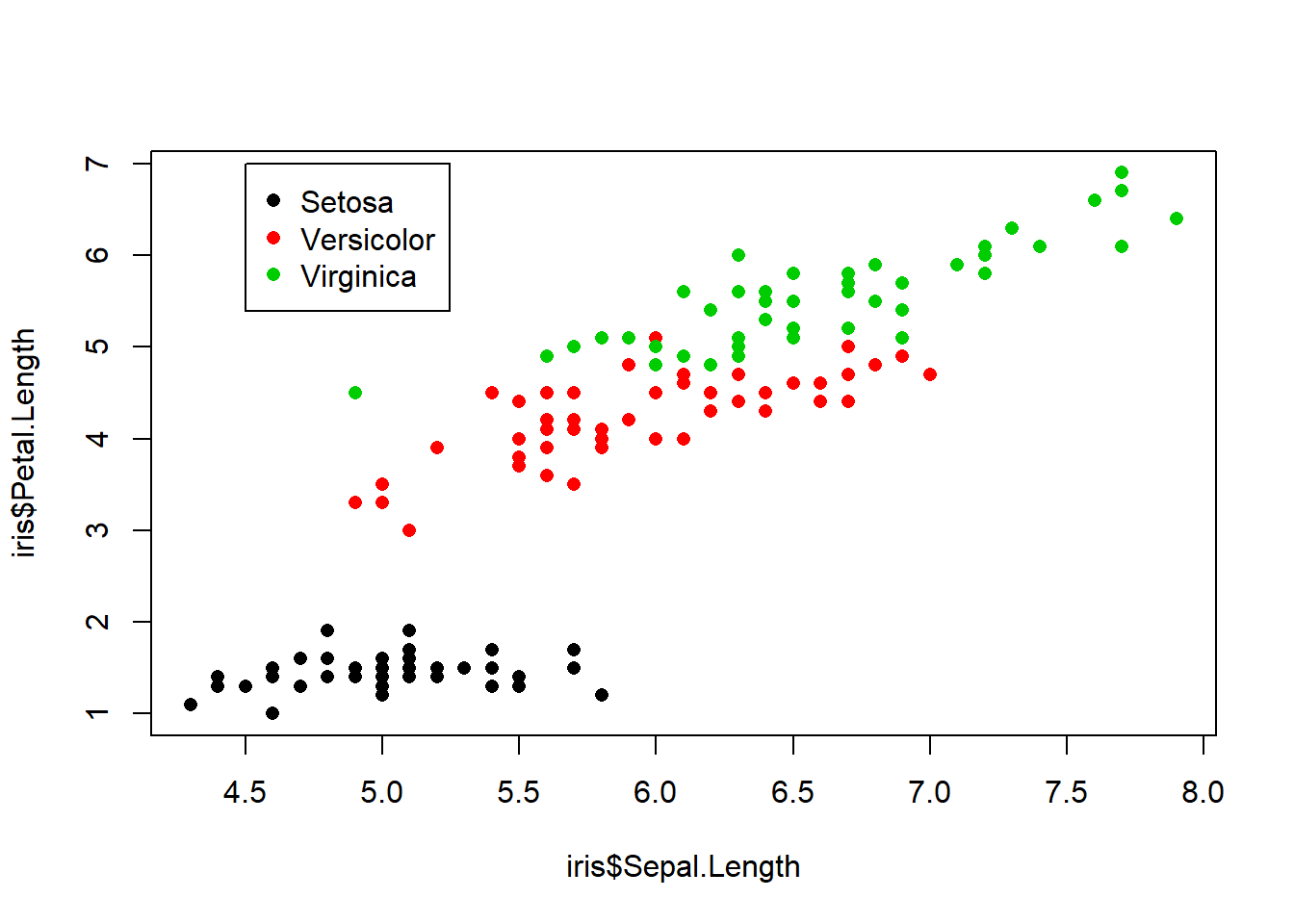
Base Plotting in R
str(airquality) #view data structure## 'data.frame': 153 obs. of 6 variables:
## $ Ozone : int 41 36 12 18 NA 28 23 19 8 NA ...
## $ Solar.R: int 190 118 149 313 NA NA 299 99 19 194 ...
## $ Wind : num 7.4 8 12.6 11.5 14.3 14.9 8.6 13.8 20.1 8.6 ...
## $ Temp : int 67 72 74 62 56 66 65 59 61 69 ...
## $ Month : int 5 5 5 5 5 5 5 5 5 5 ...
## $ Day : int 1 2 3 4 5 6 7 8 9 10 ...hist(airquality$Ozone) #histogram plot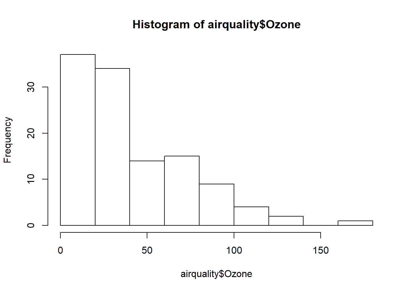
airquality <- transform(airquality, Month = factor(Month)) #make data object and transform month to factor
boxplot(Ozone ~ Month, airquality, xlab = "Month", ylab = "Ozone (ppb)") #plot by month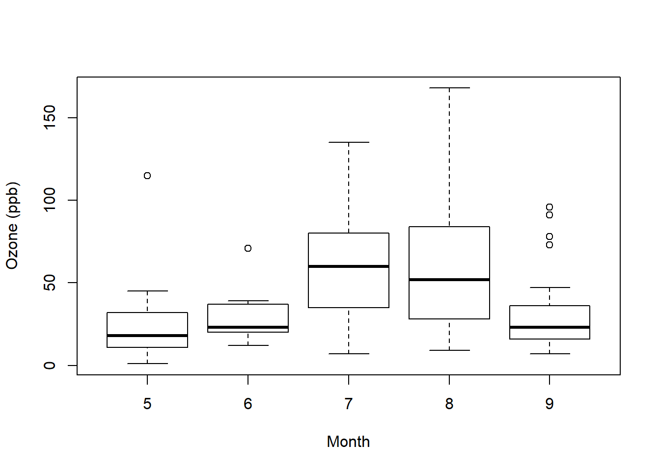
par("lty") #linetype solid## [1] "solid"par("col") #color black## [1] "black"par("pch") #symbol 1 (circle)## [1] 1par("bg") #background color white## [1] "white"par("mar") #margins around plot## [1] 5.1 4.1 4.1 2.1par("mfrow") #graphical parameter number or rows matrix is 1## [1] 1 1with(airquality, plot(Wind, Ozone)) #plot ozone to wind
title(main = "Ozone and Wind in New York City") #label graph title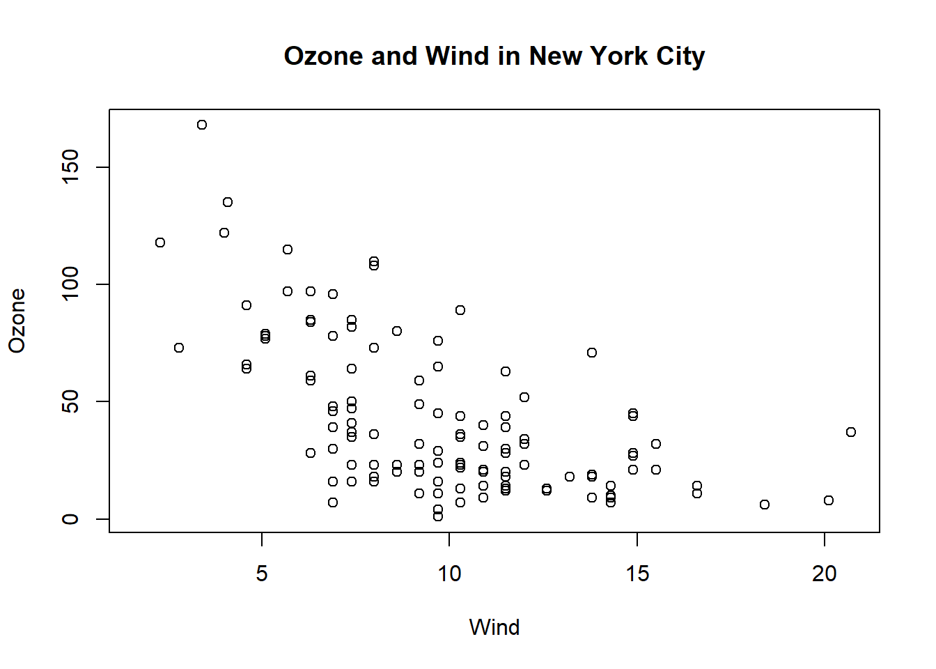
with(airquality, plot(Wind, Ozone, main = "Ozone and Wind in New York"))
with(subset(airquality, Month ==5), points(Wind, Ozone, col="blue")) #add color to show May points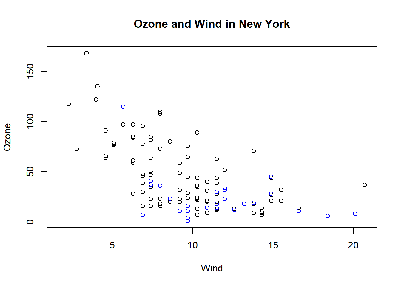
with(airquality, plot(Wind, Ozone, main ="Ozone and Wind in New York City", type="n")) #setup again
with(subset(airquality, Month ==5), points(Wind, Ozone, col = "blue"))
with(subset(airquality, Month != 5), points(Wind, Ozone, col = "red")) #this time add red to months not May
legend("topright", pch = 1, col = c("blue", "red"), legend = c("May", "Other Months")) #add legend and color appropriately.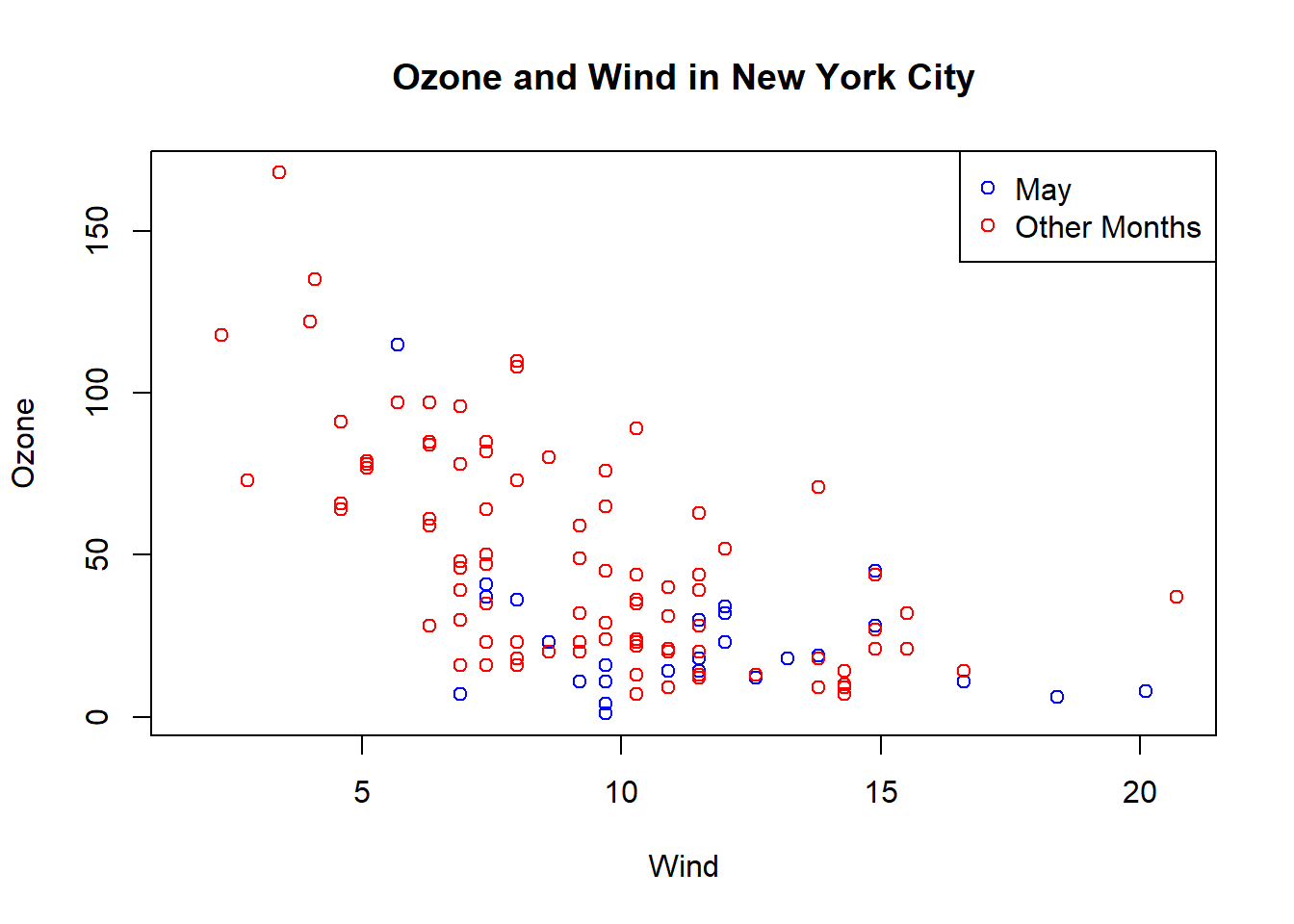
with(airquality, plot(Wind, Ozone, main= "Ozone and Wind in New York City", pch =20)) # and regression line
model <- lm(Ozone ~ Wind, airquality) #linear model
abline(model, lwd =2) #line weight of 2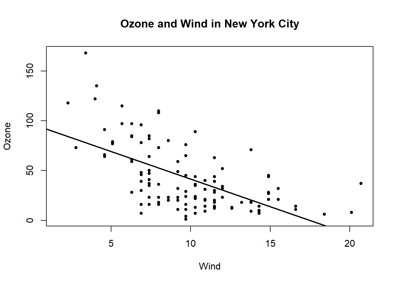
plot.new()
par(mfrow = c(1,2)) #set graphic parameter 1 row 2 columns
with(airquality, {
        plot(Wind, Ozone, main = "Ozone and Wind")
        plot(Solar.R, Ozone, main = "Ozone and Solar Radiation")
}) #makes 2 side by side plots of wind to ozone and solar radiation to ozone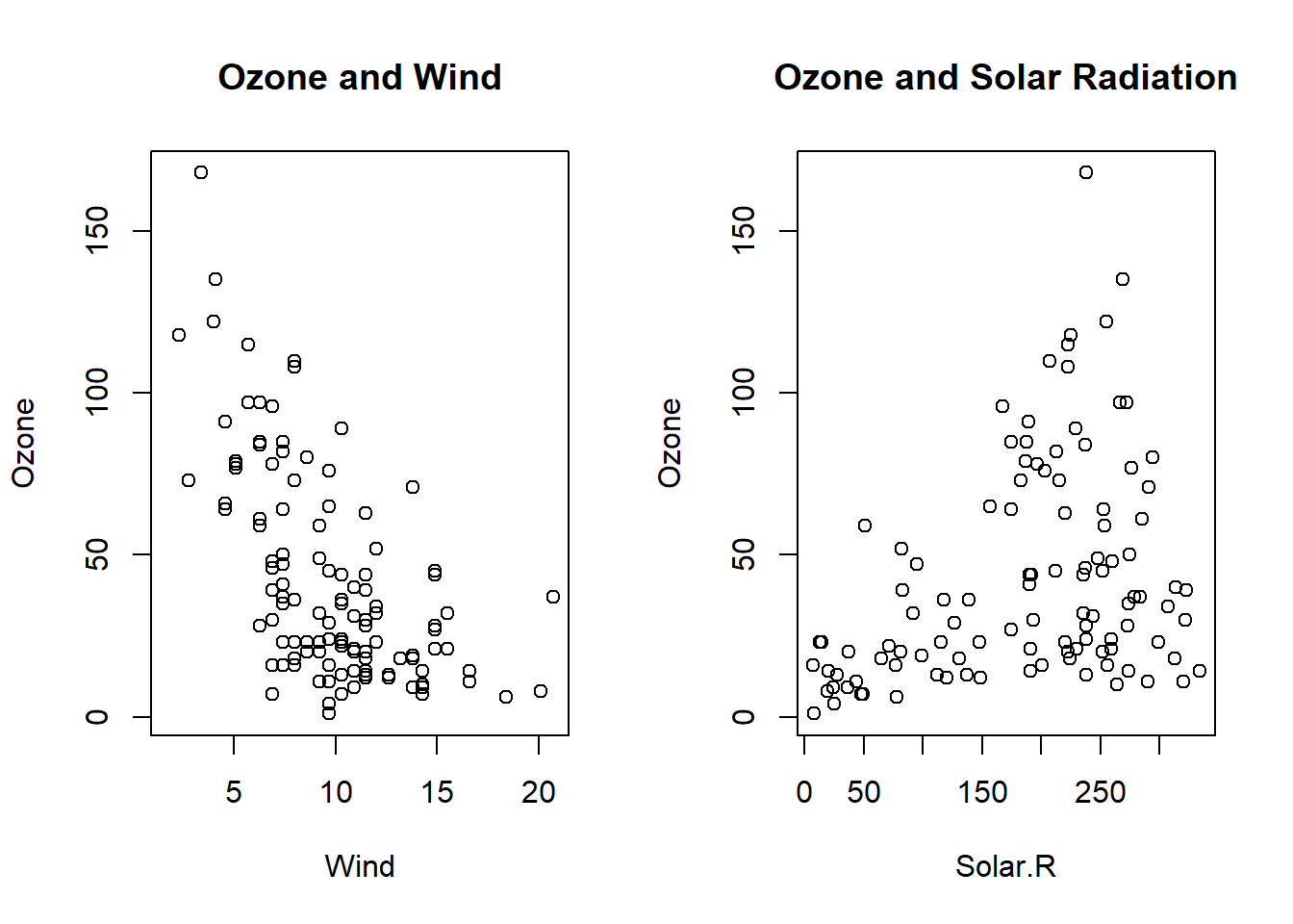
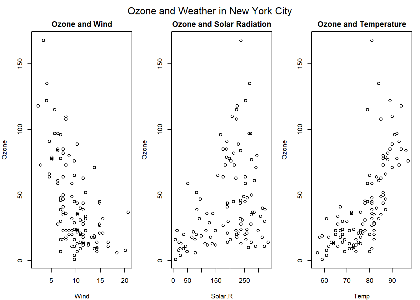
3 side by side plots.
par(mfrow = c(1,3), mar = c(4,4,2,1), oma = c(0,0,2,0)) #set parameters 1 row 3 columns
with(airquality, {
        plot(Wind, Ozone, main = "Ozone and Wind")
        plot(Solar.R, Ozone, main = "Ozone and Solar Radiation")
        plot(Temp, Ozone, main = "Ozone and Temperature")
        mtext("Ozone and Weather in New York City", outer = TRUE)
})